
Once calculated, the Discipline score can be represented in a number of different ways.
To view the discipline score, click results in the main menu and select discipline score on your left had side below dashboard.
Users can only see scores relevant to their access level and team membership.
Drilling down
As a basic principle, whatever 'level' you are on is what discipline score will display. You are required to drill down to access lower level scores. This can be done on the left of the grid chart at the bottom of the page, or via the breadcrumb that is created at the top of page, or in the case of the pie chart, you can click direct on the area you wish to view.
Linked items
Clicking on one part of a chart or graph generally affects the other charts and graphs.
If you get lost and want to reset it is easiest to go back to the first bread crumb at the top left of the page.
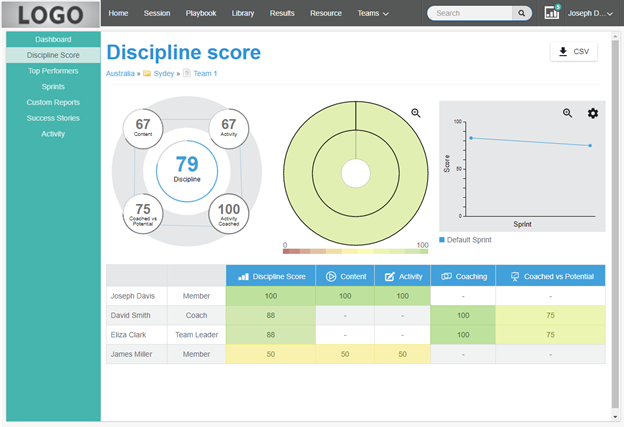
Circle Chart
The five circles of this chart show the individual scores that go into a Discipline score.
The highlighted circle matches what is displayed in the pie chart and line chart.
Clicking on the different circles changes the display of the pie chart and line chart accordingly. For example, if you click the activity circle then the pie chart will display a view based only on the activity score.
The think line surrounding each circle changes relevant to the number. A score of 100 would mean the line is completely closed.
The think lines connecting the four outer circles moves in or out relevant to the score it connects to.
Pie chart
This chart displays a visual representation of the entire group.
Group - is represented as the inner circle.
Categories - are all the layers moving out from the inner circle.
Teams - are on the outside of the circle.
Each layer is connected to that which sits above or below it in the hierarchy.
Hover over any section to see its name.
Click on any section to change the other graphs on the page and view the relevant stats.
Each section is colour coded to represent completion as per the scale below it.
Note: If a user is only in one team, they will not see this chart (as it would only display a full circle representing their team).
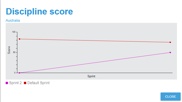
Line graph
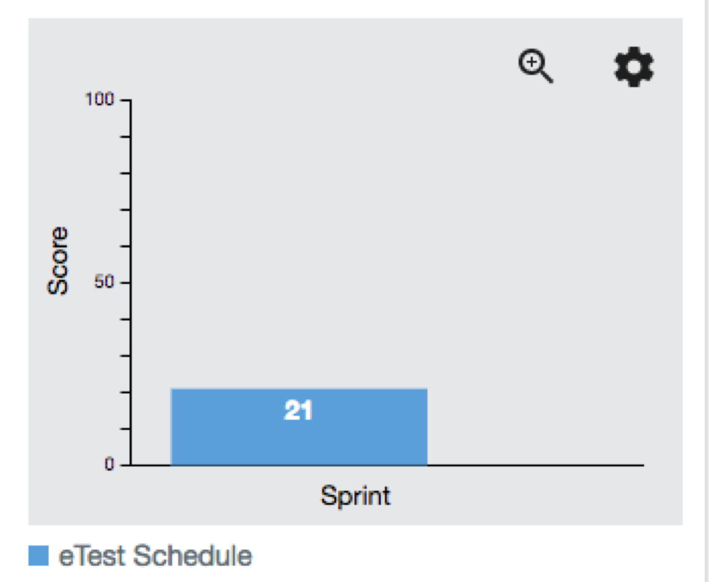
This graph shows the sprints (schedules) relevant to the score that is shown.
Each dot represents a session in that sprint.
Clicking on any session changes the view to a bar chart.
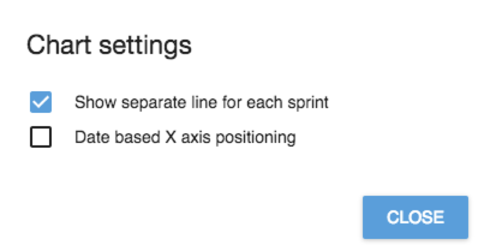
Open the cog to access settings for...
'Show seperate line for each sprint' adds individual lines for each sprint. Un-clicking this merges the sprints together.
'Date based X axis positioning' moves the sprints to display based on time.
Grid
The grid shows a rolled up view of all the categories and teams.
To open a category click on it. Teams and/or more categories will open up.
continue to click down until you get to where you want to go.
Clicking on a team will show you all the members in that team. This is the lowest level.